Building a SpaceX Launch Dashboard
Taylor Segell

- Published on
- Duration
- 2 months
- Role
- Lead Developer
- Atmosphere
- Collaborative and Innovative
- Technology
- REST API, Dash, Python, Flask


Building the SpaceX Launch Dashboard
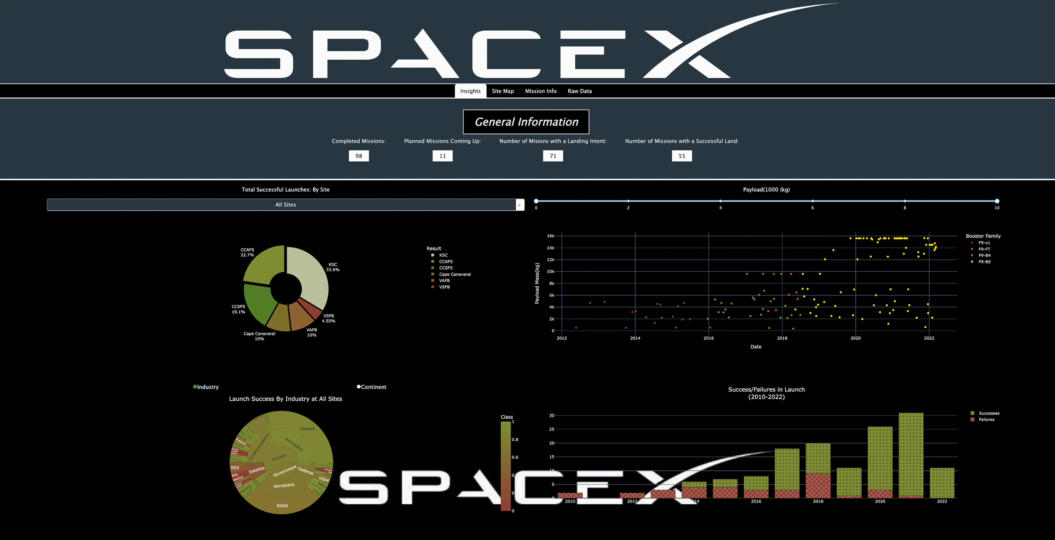
Welcome aboard the SpaceX Launch Dashboard, where we take a thrilling journey through the cosmos of past SpaceX launches! This open-source project aims to create a seamless pipeline from a REST API, using Dash, Python, and Flask. Buckle up as I explore the challenges faced, the solutions devised, and the impressive results achieved!
Challenge
Creating a dashboard is like trying to assemble a jigsaw puzzle without the box cover—it's tricky without a clear vision! The goal here was to display a plethora of launch data from SpaceX, but with a twist: the information needed to be not only accurate but also visually engaging. After all, nobody wants to stare at a wall of text when they could be viewing beautifully rendered launch graphics. The mission was to transform raw data from a REST API into a user-friendly interface that even the most casual space enthusiast could navigate.
Solution
To tackle this cosmic conundrum, a streamlined process was established to fetch, process, and display the launch data. By leveraging the capabilities of a REST API, access was gained to a treasure trove of historical launch information. Dash, with its interactive visualization features, became the trusty co-pilot in crafting a dashboard that was both informative and visually appealing.
Implementation
Here’s how this ambitious vision came to life:
- API Integration: The dashboard was connected to a REST API, allowing for real-time data retrieval that made the launch information as fresh as a launch pad at dawn.
- Data Processing: Using Python, ETL (Extract, Transform, Load) processes were implemented to clean and organize the raw data. It was akin to sending the data through a space scrubber to ensure only the best made it to the dashboard!
- UI Design: Utilizing Dash, an intuitive interface was designed that allowed users to explore past launches effortlessly. Think of it as crafting a user-friendly spaceship cockpit—everything in its right place for an optimal experience.
- Visualizations: Eye-catching visualizations were incorporated to showcase key metrics such as launch dates, rocket types, and mission outcomes. Why settle for boring numbers when visually stunning charts could do the trick?
- Testing and Iteration: The dashboard underwent rigorous testing to ensure smooth functionality and an enjoyable user experience. After all, a smooth launch is essential for any successful mission!
Results
The final product? A fully functional SpaceX Launch Dashboard that provides a delightful experience for users wanting to explore the wonders of space travel! This solo endeavor not only serves as a valuable resource for space enthusiasts but also highlights the power of individual creativity in the tech community. The dashboard is now live and ready for exploration, proving that even the sky is not the limit when it comes to data visualization!
Feel free to check out the code and contribute to this project here. Although there's been a pause on further development, the hope is to pick it up again soon!
Newsletter
Stay tuned
Articles, links, and notes on data, AI, and building—roughly weekly in your inbox.